

So what is Komawari?
Paneling for manga is done in the same spirit of western comics: creating a smooth experience for the reader. However, the thought process behind how it is done is a little different. “Koma” themselves are the panels. Komawari refers to the layout as a whole, and its flow.
From san-dangumi to wakusen there's a lot to cover. With our intro out of the way, let's get started!
Reading direction
The most notable difference between the two is the reading Direction.
Most manga does read right to left, traditionally. However, there is a movement of “Manga-inspired comics” that are in a manga style, but read left to right like western comics. Additionally, there is manga made in Japan also reads left to right! It's ultimately up to you and/or your editor/publisher. Don't feel like you HAVE to make something right to left just because you want to make a manga. If you DO want to make a manga, you should consider what reading direction you’d like to use and what sort of audience you are targeting. Taking manga that is right to left to an audience not used to reading them could be confusing and vice versa. Whatever you decide to do, commit to one or the other, you can’t change it halfway through (not easily anyway).
In fact most manga printed in the US prior to 2000’s era was flipped to read left to right before it was sent off to the printers. Publishers were worried that the reading direction of traditional manga wouldn’t be popular here with audiences in the United States and Western world. One of the publishers you can credit to the rise of right to left manga being brought to the states is Tokyopop. It decided to being Authentic manga back and within time, other publishers, like Viz Media adapted this as well.

Dangumi: Manga's Grid systems
In western comics, the 9 grid system is generally considered a good place to start. That is 3 rows wide and 3 rows tall. However, in manga there are two main grid systems, 2 wide by 4 tall (yondangumi) and 2 wide by 3 tall (sandangumi).
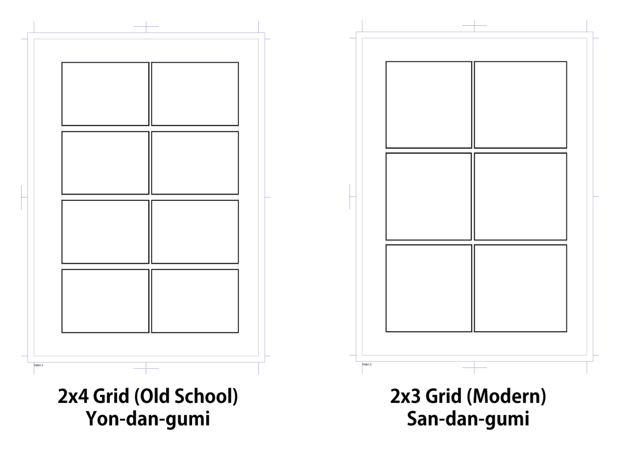
The 2x4 grid system is considered the old school layout system. However, more modern manga works like Naruto and One Piece tend to rely on 3-panel layout. However, some more traditional creators, like Rumiko Takahashi (InuYasha, Urusei Yastura, Mao) are still creating content mostly in the old school method.
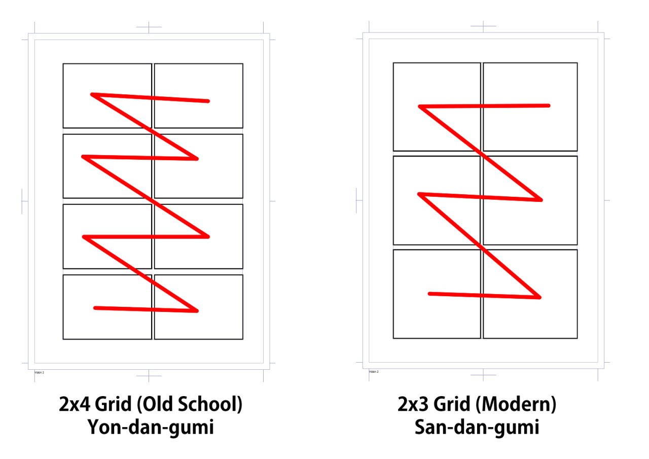
Since manga is read from right to left and top to bottom, it creates a very easy to read system. Remember, manga starts from the right side of the page and moves towards the left, then down to the next line. This is only the first step of the paneling process, the next would be how to convert this basic grid into a full manga page that looks dynamic and exciting. This particular episode is about the basics, the nitty-gritty details will be covered in the next article, as it would make this one too long.
Using both of these methods, 6 to 8 pages is the general number of panels you’ll have on a page. You don’t want to go over 8 very often, if at all, as it can crowd your pages, just like in western comics. You can also go down to 2 or 3 or even a single splash page in manga, but you don’t want to do it too often. Too much of a cool thing isn’t exciting anymore, so use splash pages and double page spreads sparingly.
Wakusen and Gutters
A subtle difference, but hard to unsee once pointed out, is the gutters of manga. Manga panels, koma, are grouped together horizontally to make it easier to tell the order of panels. The horizontal gutters will always be bigger than the vertical gutters. There also isn't really a translation for "gutters". In Japanese culture and language, the "space between" concept works with the concept of time, thus the varying gutters.
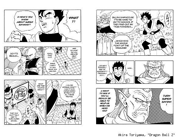
Akira Toriyama has well known for his extra large gutters that appear in each of the various Dragonball series mangas. The smaller gutters are less time, thus are keys on what to read next. The larger gutters help group panels together and signify a "new block of time". An interesting note here about the distance of gutters, there is no real set width for either set of gutter, however there are general standards depending on the publisher. If you are interested in these numbers, look into measurements of the publisher you wish to emulate. However, don't feel like you need to limit yourself to the numbers publishers use. You can increase gutter distance as an effect to "increase" the length of time that pass between panels. There are even special panels that are blank for the same effect.
The lines that create the "koma" the panels also have a name and general standards of width as well! These lines are called "wakusen" and ususally are 0.5mm to 2mm in width. Most often they are drawn with "millipens", called multiliners in the Western world. These pens have flat nibs that create consistent smooth lines and are perfect for making neat and clean panel lines.
Rough pages versus dense pages
Rough pages contain less panels and dense pages contain more panels, which means more information. Knowing when to use each panel, just like in comics can make a big difference.
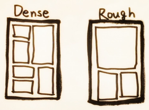
Dense pages have smaller, quicker actions. The pacing of these pages is much faster than the slower Rough pages. As suggested, Rough pages have fewer panels, but tend to be larger. You don't have to have all panels be roughly the same size, as the size of the panel can still affect the reading speed of the user.
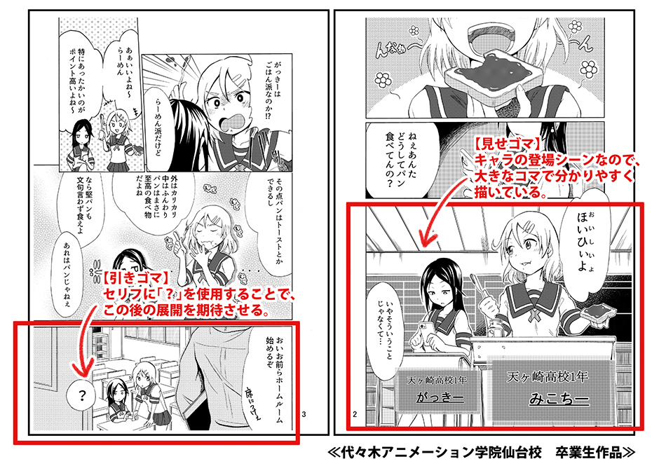
Both types of "layouts" tend to contain what is called "Misegoma", or the focus panel. In the example above, the bottom right panel is the main focus of the page. The highlighted panel on the left is "Hikigoma" referring to part of the page turn effect. This is something we will cover in the next article. On the left page, the panel above the hikigoma panel would be the most important as it gives the most information relevant to the scene, so it is given the largest frame.
Each page should have one panel that is the most important. Just like illustrations that have a focus point, or a single point that contains the most information or makes the most impact, manga pages have the same concept. Usually these Misegoma are the largest panel on the given page. You don't have to make this panel more detailed than the others, though it could help it stand out. It's size, being larger than the others, will make it stand out already if done well.
That's a lot of new information! Let's take a break and revisit some more facts about manga paneling in our next article. Some of things I'll cover are:
How to use the 2x4 and 2x3 grids to generate your panel layouts
Page Turn effect: Hikigoma and MekuriGoma
Oblique panels (panels that have angles and don't have square corners)
Impact / Passing time panels - Magoma
For now, I'd like to offer you some resources for continued learning about the topics I covered today and some of my future topics!
Resources:
- Komawari #1 by Manga Senpai / Tokyo Name Tank
- Manga Panel Layout Basics - “2x4” Grid by SMAC! The Silent Manga Audition Community
- Manga SOS #1 - Paneling - by SMA Manga SOS
- Manga Training #10 - Basics of Komawari lesson 2 by Manga Training
Thank you all very much for reading today! We'll see you next time with more Manga Paneling! Have a wonderful week!
~ ArtCrumbs and the GlobalComix Team