

No matter the format we use to tell our stories, be it comics, manga, comic strips or koma, we need to understand the flow of a page. By flow, I mean panel to panel, bubble to bubble, and eventually, page to page. A good flow is very important, as it keeps the reader reading. Any type of disruption in that flow can knock the reader out of the experience and possibly cause them to stop reading. That's obviously the last thing that we want.
With that flow we need slower times and faster times, this is called pacing, or timing. You don’t want to speed through a moment that needs to be slower, but you don’t want to drag out something that isn’t interesting or super relevant either. In addition to our speed, the arrangement of panels and the order to read them in must be perfectly clear.
With these tools, let's dig deeper into paneling for comics! If you make manga don’t worry, we’ll cover that in a future episode.
The 9 Grid System:

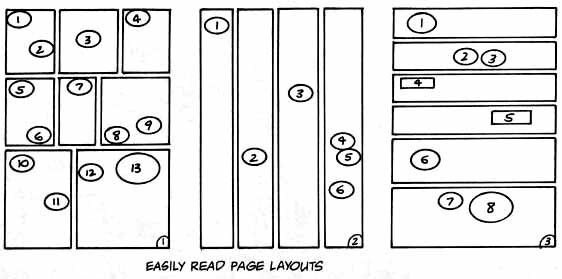
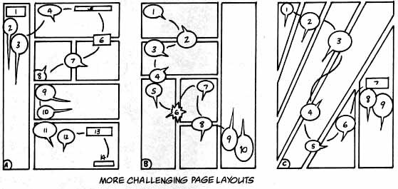
The most basic flow in comics is the nine panel grid. Watchmen in particular is well known for using this type of pattern, shown in the example above. What’s interesting to note is that most pages of Watchmen are some variation of this grid. Some panels get merged together to create a larger panel. This is generally the basis for western comics. Below are some examples of this 9 Grid variation. It's a good go-to when you are uncertain of how to place panels.


In floppy comics, you don’t really want to do more than 9 panels on one page, otherwise your text might get too small and hard to read. Using this most basic grid, we can work on our page flow, our panel to panel flow. Not only can the layouts of the page help in reader direction or "leading the eye" but the contents of the panel can guide the reader as well! In the sample below, we have a great example of how the contents of each panel can help direct the flow of the pages. The original and then a copy with lines to help see if you don't see how the artwork leads you to keep reading.

In western comics, the reading direction is left to right and then top to bottom. Our eyes will scan a page left to right and when we reach the edge of the page, we will naturally move back to the left side, a little further down, and scan left to right again. Understanding how your reader will perceive the page, and making it as easy as possible, will make your pages pleasing to the eye and easy to read. This is how to use flow to your advantage! Here are some more examples showing the original page, and then another with a red line illustrating its path:


Isn't it amazing that you can even do this without needing to include any dialogue at all! Using the contents alone, you can easily let your reader know what needs to be read and in what order. Also, not how there are panels of varying size? Small panels tend to be read more quickly, the eyes spend less time on them. These are best used for quick actions, and insert panels. A lot of these small panels together can give the impression of a short succession of small actions.
Adding in a larger panel would cause the eye to linger on this longer panel for more time, for example, check the last two panels in the images above. Our character has a short glance at the pink eyed figure, and the next panel is even larger! The figure feels like it is staring down our main character. This can put anxiety in the reader and makes a great page turn set up! Even the slightest change in length can really affect the perceived time spent on that panel. A single large panel can halt a well moving flow if placed incorrectly. Or a bunch of large panels can cause the comic to move too slowly and bore the reader.
The page below from Invincible shows how you can use larger panels to slow down the passage of time when needed. In this case reflects how Mark is processing new information given to him. He struggles to process this initially, so the long and larger panels work here to mimic that long period of time.

Pacing, or Timing is the name of this factor that we have to think of. It's a bit more detailed in the paneling of manga, but the basic principle is the same in both comics and manga. Like any film or animation or movie, you want fast moments that are exciting and thrilling or even terrifying! You want slower movements, be it painfully slow on purpose, building suspense or fear. Perhaps two characters are having an important discussion, a heavy topic, or the mood is sullen and dark. Larger panels, showing how slow and painful these moments are for your characters can impress those feelings on the reader. Once again, being able to perceive the reaction of our audience is critical!
It's helpful to plan this sort of alignment, panel size, and direction in the layout, or sketching, stage. Here are the original sketches from the above page:

As you can see, the artwork doesn't need to be fully fleshed out. Drawing a line over your panels to see what the reading low is versus what you want it to actually be can provide an insight into how your readers might interact with your page. Remember, you want to keep this experience as smooth as possible for them!
That said, there is one major black sheep of comics in terms of panel layout, and we'll get to that next.
The Mystery Layout:
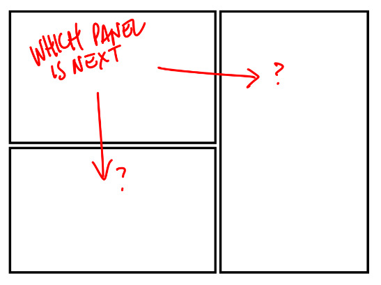
One interesting thing to make a note about is this specific layout of panel shown above. In western comics, I mentioned before that the reading order is left to right and THEN top to bottom. Here we have ourselves a bit of a conundrum. Do we:
1. Read the top left, then big, then bottom left?
2. Read top left, bottom left, and then big on the right?
I noted that a lot of manga readers (and including myself) stated the obvious solution was the second option. However this is to be considered for western comic format. Following our reader rules, the first option would be the proper one. So how do we solve this sort of problem?
In a recent twitter post by Matthew Dow Smith, it was pointed out a possible solution is to use dialogue bubbles to insinuate which direction to read next, as illustrated below:
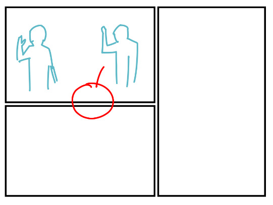
Not only is this a smart solution, it's a regular principle that creators could and should take advantage of. Using the bubbles, and not just the panel layout or artwork inside, can be helpful in providing direction. Another possibly helpful option is context, meaning if the actions or contents clearly spell out which panel is next, you could use this layout. However, be careful in knowing FOR SURE if the order is obvious to your readers. Always get feedback from a trusted colleague, friend, or even your own readers if need be. It's better and easier to fix this sort of problems early in the process versus later and possibly end up redrawing panels. Nobody likes that!
Balloons for miles:
Just how can you use balloons to direct the eye? When I was in school, I had been told that the bubbles should be in the top 1/3 of the panel. I personally found this to be quite restricting in limiting the flow of the dialogue. It also made varying up my panel compositions difficult. Below are but a few examples of how you can use balloons to lead the eye around a page.
The above example contains simple layouts. Notice how the bubbles tend to guide your eye around the page. As an example exercise, try to draw your own line through and see how you actually read these pages. When you are ready, I'll share some more examples below:
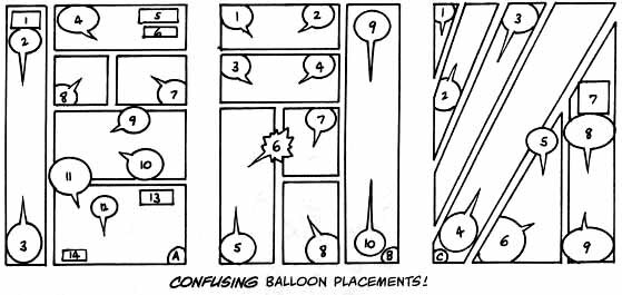
The example above is indeed confusing. The panel direction on its own is generally pretty clear, but the bubbles make it far complicated. This is why we need to be aware of not just our paneling, but how the content within the panels, including bubbles, makes the page readable or unreadable as a whole! Below is a sample of how the balloons can be simplified and organized!
It might look fairly complicated, and it is. These are pretty detailed pages, but it's magical how you can get some really dynamic pages when you combine good paneling with some good balloon arrangement! Imagine some killer art on top of these, and you've got some bloody fantastic pages! In reality, there are an infinite number of panel combinations other than just the standard boxes, but even then we have so many possibilities. If you ever struggle with ideas, you can always look up templates or read your favorite comic books for inspiration!

I personally adore this particular guide as a wonderful reference for the basic panel layouts. Even though I make manga, and not usually comics, I find it wildly helpful. Sometimes I can even mix and match two templates together to get the perfect layout I'm looking for!
A Final Note about Paneling:
When it comes to the contents, sometimes it's hard to know what exactly to put inside of them. This is one reason why a lot of comic creators make a script. While making the script, you have two options, you can storyboard or "layout" while you are scripting, or you can write out detailed descriptions of what you want your panels and pages to look like. Neither of these techniques is the "right one", but if you are working with an artist, sometimes it can help to have a rough sketch or idea of what you, the writer were thinking about!
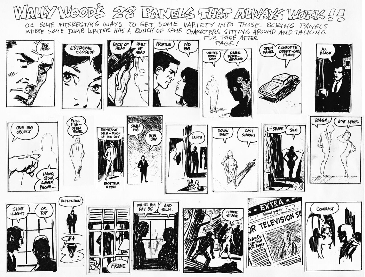
If you are stuck and don't have many ideas on how you want to show a scene, Wally Wood has a fantastic visual guide. These are known as the "22 Panels that Always Work". These are helpful for difficult scenes or when you need something a little different or unique, or maybe a new perspective on a continuous scene. It is especially helpful for longer periods without a lot of movement or action! We don't want a bunch of floating head panels!
Closing thoughts:
Paneling is difficult. It's difficult for the writer and difficult for the artist. If you can combine a strong visual narrative skill, knowing what shots to use and how to use them with a strong paneling skill, knowing how to lead your viewer around the page, your story will be strong. Being able to make comics takes a wide range in skills. This is one of the more difficult ones. Making comics is as easy as slapping blocks on a page and adding some bubbles. However, what will separate a professional from an amateur is being able to skillfully do this in a way that pleases both the story, staying true to its meaning and intention and creating a pleasant experience for your reader.
It's very tempting to make pages that -look cool- and have seemingly really dynamic and unique panel layouts, but this should never be done at the expense of readability. It can cause a reader to put a book down, cost you a sale, or a customer in general. We don't want that, obviously. So take the time to think about your layouts and flow, not just the content within.
This was a lot of information and next week we'll dig deeper into paneling with blockage, types of gridding, gutters and more! If you would like something not discussed that I didn't include today, please let me know below in a comment!
References:
As usual, I've got a list here of extra resources including those I used to research for this article. Please give them all a look.
- How to Layout Your Comic! by Art Rocket
- Comic Panels and Comic Layout by Creative Comic Art
- Flow & the Eyelines by Making Comics with Salgood Sam
- Dispelling Myhs about Comic Layout by Visual Language Lab
See you next time!
~ AhkwardKat and the GlobalComix Team