

In our last Creator Tips and Tricks article, we talked about the basics of paneling and flow. This week, we are going to dig a little deeper into this flow idea. Understanding gutters, panel layouts, and how to make your pages easier to read. A confusing page could cost you a reader, and nobody wants that!
With that introduction, let's dig into Gutters and Panel Layouts!
Looking at a standard comic page as a reader, you might not know that these pages are very carefully crafted to keep you reading. As a creator, you might know the pages take some time to plan and create. Now that we have some understanding of comic flow from our last article, visual narrative, and margins from previous articles, we can work on understanding gutters, gridding, and blockage.
About Gutters

Firstly, what are gutters? Gutters are the spaces between panels. In western comics, these are usually universal on all sides of the panels. In manga they vary (and have patterns to when gutters are thick and thin), but in comics they are generally universal in width.

That said, not every single “panel” needs to have a gutter or universal gutter. You can have “borderless” gutters if you wish to! In traditional Western comics, it was a lot less common to have panels that bleed to the edge. Manga creators will know that this is a very common thing, almost expected in a way. It can make a panel feel larger and help amplify dynamic artwork inside of them. Negative space is even more powerful in these types of panels. The above image from Scott McCloud's Understanding Comics mentions this as well.
About Blockage

There was a very interesting study done by Neil Cohn regarding panels and what is called “blockage”. Blockage occurs when panels are stacked vertically next to a taller panel that runs the height of the stacked panels.
There are different possible types of Blockage that you could run into with this. In my previous Tips and Trick Blog, I actually covered one of these scenarios. The study found that when this particular type of arrangement of panels was made, readers didn’t read them consistently. Sometimes readers would move to the right first, and some readers moved downward, reading the full-length panel first, then the smaller panels. Check out the image below for more information about this!
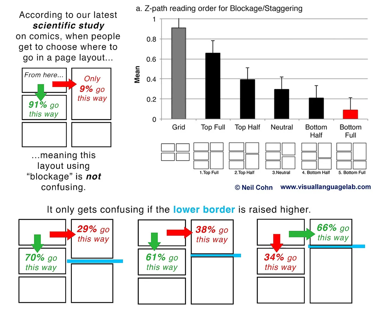
So how can we prevent this from becoming a problem? Artwork using leading lines and using your bubbles was a solution I gave in my last article. Another would be to stagger your panels, overlay them or create separations (wider gutters) versus creating a blockage or using the context within the panels to make it obvious which is next. That second one is a bit harder to pull off, so let's talk about staggering and overlaying panels.
When we are creating a page, we need to look at firstly where the Entry point is. What is that? As the name suggests, this is where your readers will enter the page. If you don’t have any diagonals or angled panels, it’s safe to assume readers will start at the top left. If you do have these angled or diagonal panels, make sure your first panel, your entry point, is obvious, and the reading direction is clear from there.

From there, we have various types of ways that panels can line up (forming our gutters). Looking at the sample image above, we can see various ways to set up panels together:
- A. Pure Grid, these are when the panels line up evenly leaving a perfect intersection in between. This is the most basic type of paneling and is the easiest to read. (Watchmen uses a basic grid for most of its pages)
- B. Vertical Staggering, These are when panels don’t line up greeting a cascade, much like a waterfall going back and forth, on the sides of the panels. None of the panels line up perfectly to form a pure grid or blockage.
- C. Horizontal Staggering, Much like the vertical staggering, but when panels don’t align on the horizontal axis (top and bottom of the panels).
- D. Blockage, as mentioned before, this is what two shorter panels match the height of a larger, taller panel. They don’t necessarily cause a problem, but are possible problem areas. You can usually spot these by looking for sideways T’s.
- E. Whole Row, This is when a panel runs the whole width of a page.
- F. Inset, These are panels that sit inside other panels. If the inset is on the left side of the bigger panel, you’d read the inset first, then the rest of the larger panel on the right. If the inset panel is on the right side of the larger panel, you’d read the larger panel first and as you move towards the right, then read the inset. In the example here, you’d do the latter.
- G. Separation, This is when you widen the gutter, creating a space between panels. This can accomplish two tasks depending on layout. You can use it to group vertical panels together. Or, you can use it to slow down the reader by putting that larger gap in a single row of panels or infer a gap of time / change of scenes.
- H. Overlap, this is when a panel sits on top of the other without a gutter between them, usually not on all sides of the panel. This is not the same as an inset panel, however like an inset panel, these are typically meant to be read together (though still in order). The lack of a gutter between them shortens the perceived time between panels, so use it wisely!
- I. Bleed, Lastly, we have our “Bleed”. This is when a panel has no borders and goes all the way to the margins, or bleeds, of a page. It can create some beautiful full artwork. This is actually very common in manga as well!
If you need some more examples of these different layouts and gutter arrangements, you can see the examples below, again from Neil Cohn’s study.

After all that hard work, did you know that you can simply default to the 9 Panel Grid? Or any grid that creates a pure grid in your gutters? The Watchmen Comic was quite famous for this, but yet we have one more very creative solution to paneling. It’s not for the faint of heart!
Other Paneling Solutions
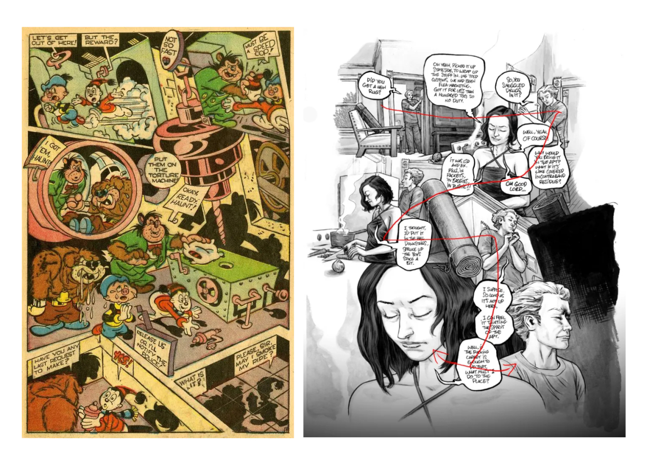
How about NO panels at all!? Yes, this is completely valid. The trick with this type of set up, however, is that the reader is entirely dependent on leading lines to help direct them along the page. You can also use speech bubbles to help lead the reader along. The samples above all have very clear direction and are easy to read. The super rabbit page on the left does a really good job of using the natural elements within the page itself to create the illusion of paneling combined with overlaying these elements together. How creative!
Splash Pages
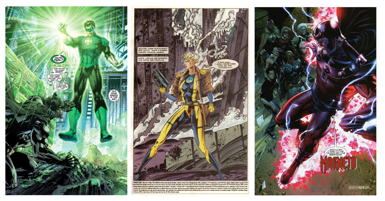
This is actually a very good way to think about Splash pages, or when a single panel takes up the entire page. When doing a splash page, you still want a flow or direction to keep the reader moving along. But how nice it is to think they’d sit there and marvel at our art skills, isn’t it? As cool as they are, we want the pages to be understandable and have the same quality of flow that paneled pages do.
That's everything folks, thank you very much for your time today. As always, I've got some references down below for your continued reading and where I gathered some information for this episode.
References
- A Panel Shaped Screen by Rock Paper Shotgun
- More than Storyboards: Comics and Film #2 - Finding the Gutter by Script Mag
- Flow, & the Eyelines by Making Comics
- Dispelling Myths about Comic Page Layout by Visual Language Lab
Thank you all again and we'll see you all in our next episode, Komawari and Paneling for Manga!
~ArtCrumbs and the GlobalComix Team