

Lineart is one of those things that seems to be something artists love or it’s the bane of their lives. It can be hard to find the right type of lineart for you and gain the steady hand to make it just the way you want it.
Today, I am going to go over some various tips for digital and traditional artists to help get a better quality of lineart. Most of these tips apply to both digital and traditional, but if something is specific to one group, I’ll be sure to point that out.
With that out of the way, let's begin!
Finding the Right Resolution
One of the number one ways to get cruddy lineart is to use a resolution too low. Going too low can create pixelated art and rough edges. Unless you are aiming for pixel art, that’s obviously not what we want. It can be harder to run larger files on a system not powerful enough for them, but it’s hopefully worth the trouble! Now, what is considered too low?
Most screen resolution is a base of 72dpi, and this is considered the "universal low resolution" in terms of art and illustration. It's the minimum. I personally would recommend, unless you are animating, to do with a minimum of 300dpi. (If you are animating, I’d go with 144dpi if you want something higher res..)
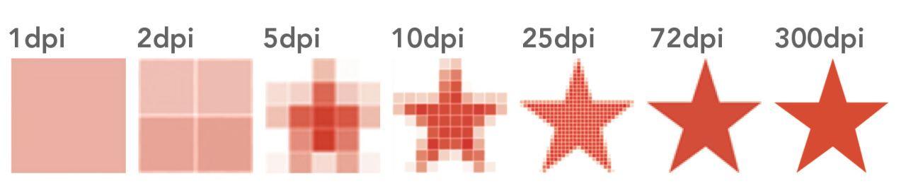
What is DPI? The term “DPI” stands for dots per inch (also called PPI - pixels per inch) and is one of two ways to calculate resolution. 72 dpi means that for every inch in one row of pixels, there are 72 pixels in that row. 300dpi means there are 300pixels for every 1-inch row of pixels.
This is absolutely the most critical when you are creating your document initialy. In CSP, there is an option or this. Simply adding in a large amount of pixels to the document doesn't help you. You'll need t actually adjust the DPI settings when making the document. If you try to adjust the DPI after the fact, it might already be too late. These images below are the same size, in pixels, but the only difference is DPI! It can make a huge difference!

Understandably, with a higher resolution, we’ll have more dots/pixels to play with, which allows your lineart to look smoother and cleaner! Great, isn’t it? This is a small thing that can make a large difference! Typically, in most software when you create your file, you are given the option to set which DPI or PPI that you want.
Now, why do we need to use 300? Would 200 be enough? No. The reason 300 dpi is considered "high resolution", is that it is the minimum dpi needed for most printing, especially comic books and manga. That said, some printers would prefer 600 or 450 dpi. The higher the resolution, the better your prints will look. Going over 600 isn't really neccessary, but 1200dpi isn't unheard of. It can really slow down your systems if it isn't made to handle large files. The larger the dpi, the higher the performance needed to work smoothly in that kind of file size.
Now what about traditional artists? The reason you need to be aware of this is when scanning and photographing your work. You always need to be sure that you are working in a higher resolution. Working in a higher resolution will make editing scans and photos easier and, of course, just make your artwork look better overall. Quality matters right? Don't cut this corner, as it is a dead giveaway to an amateur creator. It's ok to create artwork traditionally, however you might need to take those extra steps to ensure you've got good, clean artwork.
Line Weight and Texture
Not all lines are created the same, and the variation between them is called “line weight” and “line texture”. There are so many different ways to alter a line, and there are different times to use different variations.
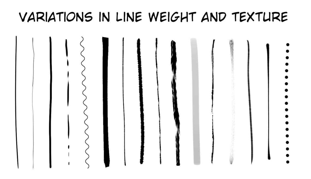
Thinner lines can give a feeling of delicateness or fragility or even grace, it can make the object feel thin or further away. Meanwhile, thicker lines look stronger, firmer and can give a deeper feeling of depth in an artwork. It can make things feel thicker or closer to the viewer too.
A solid line feels stronger, more… solid! A line that isn’t consistent, or even has breaks can feel unstable, rougher and fragile. Color matters too! Usually the color surrounding the line has an impact on the color of the lineart itself, but in comics, usually you can use a color adjacent to the object it outlines to make something feel slightly more painterly. Black lines in colored artwork can feel harsher. Colored lineart can look smoother and more cohesive as an artwork overall.
You can get different line weights and textures by using different tools, be sure to use the right one for the job. Bushes, multiliners, felt pens, G-pens, sponges, white ink, good paper that won't warp or bend with all that ink, and the right ink (pigment versus water-based ink). Having the right tools for the job at hand matters. While it can be expensive to gather all the different supplies you need, even with digital artists, the right tools matter. A good software that gives you access to these tools, knowing how to use them and investing the time to learn them. Take advantage of perspective rulers, symmetrical rulers, multiple layers, a good PC with a good graphics card and strong processor. You won't fail without these tools, and having them won't promise your success, but it can give you better odds of preforming well.
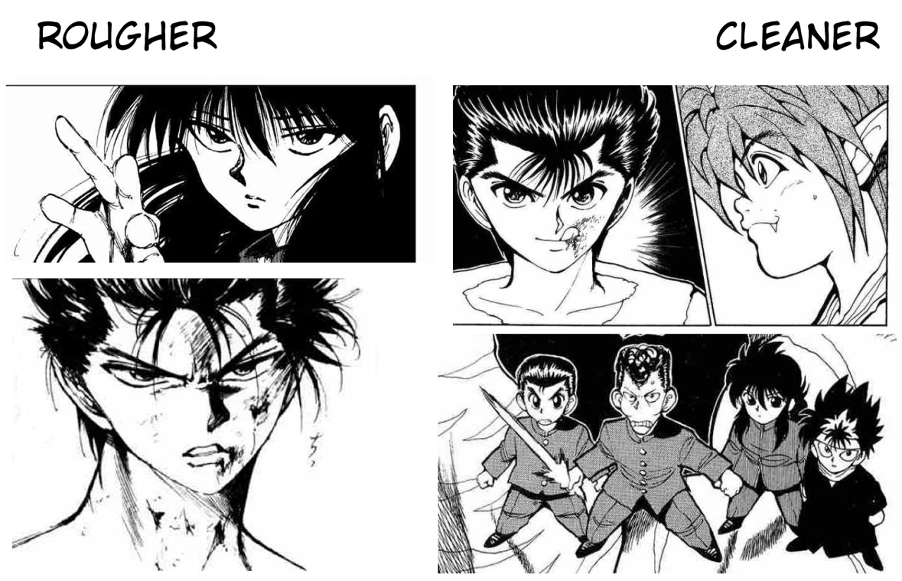
The last note I'll give about lineart is that whatever you choose to do for lineart, you can vary your lines throughout your artwork, and you should! Manga is well known for variations in lineart, usually adjusting the drawing style with the mood at the moment. So consider using this tool to your advantage! A great example of this are these panels from YuYu Hakusho. You tell me which one is more serious and dangerous? Which one is more playful and lighter emotionally?
Stabilizers and Rulers
Stabilizers are tools in digital software that are able to help correct and prevent shaky lineart. A steady hand is something that isn’t easy to achieve for some artists. It could be due to a lack of experience, but it could also be due to physical illness that someone could struggle with lineart. Some software like Clip Studio Paint and Paint Tool Sai come with stabilizers already in the software. Some like Adobe Photoshop will require you to buy / download one called Lazy Nezumi, which I have heard has good reviews. You can find a link to that below.
For those of you who have access to a stabilizer, here are some of the differences that it can make in your work. The samples here are from Clip Studio Paint.

Additionally, the use of rulers, both in digital software and either rulers, triangles, french curves, or T-Squares for traditional artists. Those who letter by hand can also make use of Ames Lettering Guide. These tools exist to make your job easier, take advantage of them. See what's available for you to use and invest the time into learning them!
Hatching and Cross Hatching
We've previously covered hatching, it's uses and benefits. But, did you know that it is a helpful tool in gaining a steady hand for lineart?
Contour hatching follows the contour of an object, its shape, its planes that form the object. It’s also a good way to practice line control. Why? It requires a lot of control to hatch and cross hatch with intention. The most basic form of hatching are lines that do not cross and are usually mostly parallel to each other. They don't have to be perfect, but the basic idea is that they run in the same direction.
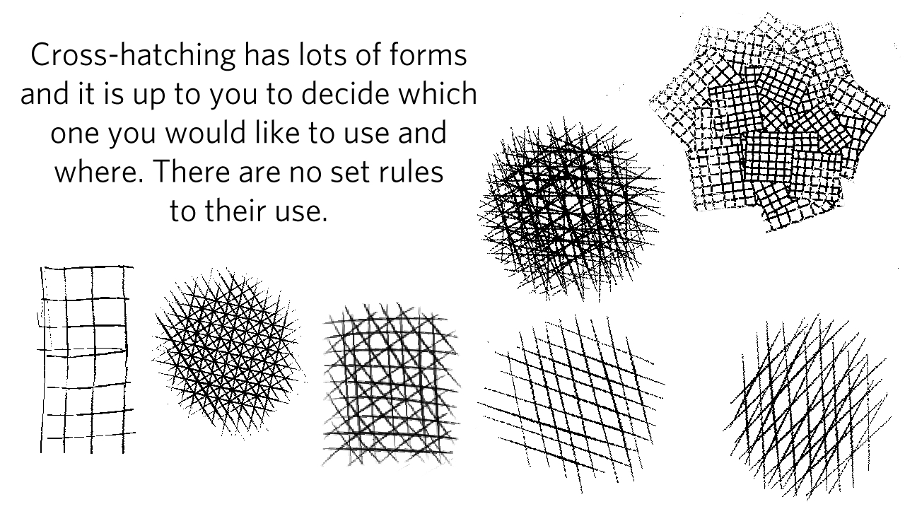
Hatching and cross hatching can be practiced on paper or digitally! So there really isn't an excuse for not doing this type of practice exercise. When doing them, try to be intentional about:
- How long are the lines?
- How thick are the lines?
- Do they have pointy ends or blunted ends?
- How far apart from each other they are
- What angle are the lines? (if you are cross hatching)
By deciding what you want to do and being able to do EXACTLY that, you are practicing having more control over your hand while you are inking and creating lineart. This is an exercise that takes time to learn to do manually. It takes repetition. I've been able to practice this a lot while on the bus, on trains, waiting for food to cook, or mindlessly doodling during commercials on TV or streaming shows.
Practice this in your down time, or intentionally as part of your warm up and cool down sessions, and you'll find that you'll improve in no time! Which brings up my final point.
Warm up and Cool down Sessions
What?? Artists need to warm up and cool down? Like athletes?
Absolutely! Why?
Just like athletes, we use our muscles, tendons, and bones to draw. It is important to remember that while drawing doesn't seem like a physical activity, it technically is. But why do we need to warm up and cool down? You can injure your body by not correctly using it, or be over stressing it. Physical injuries can occur in a second, or slowly over time, and both can cause you to have to step away from your work for days, weeks, or months at a time. If you rely on your artwork for your income, it's important to be extra careful!
How is this relevant to lineart?
When you are drawing, you should never just use your hand or wrist. Our wrists don't have a large range of motion on their own. We are used to writing this way, most of us anyway, and so it's natural that it becomes our drawing style as well. However, drawing from just the wrist limits your range of motion, and it puts a lot of strain on your wrist over time. It's not sustainable for long periods of drawing.
Drawing using your whole arm from your shoulder to your elbow to your wrist is going to spread that activity over the entire arm. It can prevent fatigue and give you a wider range of motion to get more dynamic lines. It also helps if you have a larger drawing surface, you can draw larger using your whole arm versus just the wrist. Just using your wrist puts a lot of strain on it. Having a poor posture or putting the weight of your body in the wrong places, especially for a long period of time, can cause injury or pain, making it hard to draw.
Here are some exercises that you can do to keep your arm more limber so that you can keep drawing!

It might seem sort of alarmist or boring to have to stop drawing to stretch or spend precious drawing time before and after drawing for stretching. It's so important to consider your posture and stretch your body throughout drawing. Lineart can get mechanical and tedious. It's easy to get sucked in and not move for hours. However, this is very hard on our bodies long term. Problems like carpal tunnel, tennis elbow, radial tunnel, sciatica, bulging discs, degenerated discs and more can result from not taking care of your body and sitting/standing stil lfor long periods. A happier and healthier body will produce better art. You'll have smoother, stronger hand, and with it you can make all the beautiful lineart you desire. I guess this applies to all phases of art, not just lineart. : )
As always thank you so much for reading. I hope you found this helpful and useful. This is far from an exhaustive list, and I'll have some more tips and tricks for your best lineart next time! See you all soon!
Resources
As always, here are some resources for you for further reading.
High Resolution versus Low Resolution
Lazy Nezumi Stabilizer for Adobe Photoshop
Creator Tips and Tricks #12: Hatching and Cross Hatching
How To Draw From Your Shoulder: My Drawing Technique Revealed! (on YouTube)
Animators Guide to Health and Wellness (Works for all Artists)
HOW TO DRAW GOOD LINEART (4 easy steps)
DRAW BETTER LINEART! (6 easy tips)
Stretching guide by: Kaitlin Bruder
Thank you all for joining us today. I hope you all have a wonderful week and we'll see you next time!
~ ArtCrumbs and the GlobalComix team
JKBorealis 4 years ago
Thank you Artcrumbs! The DPI info and the line art tips are really useful <3
ArtCrumbs 4 years ago
@JKBorealis I'm glad you found it helpful! I'll definitely have more tips in the next article! There are so many things you can do to get better lineart. haha Thank you for the comment!
Lgarcia-art 4 years ago
This is really helpful! I'll have to check out the Lady Nezumi stabilizer for Photoshop.