

Visual Narrative is the term used to refer to the art of storytelling with visuals as a main communicator. It includes mediums like comics, manga, commercials, marketing and advertising, soap operas, film, documentaries, reality TV, cartoon shows, TV journalism, and more. It’s a very wide field that encompasses one main task:
Show, don't tell.
This phrase you have probably heard over and over again if you are experienced in the visual narrative fields. If you are not familiar with it, let me explain this concept:
Show the audience / reader what you wish to communicate, what you want them to know, instead of using narration or dialogue to do the heavy lifting for you. While your reader obviously CAN read, it can cause audiences to lose interest to have to read lengthy amounts of text or large amounts of them over time. Being able to show that information instead creates more engagement and even emotional investment from your reader, which is the trick to KEEP them reading.
You’ll see this in movies and animations as well: ever watched a movie that had characters talking too much, that used the same angles and shots over and over again? This gets boring quickly, and too many headshots actually has a name! “Talking Head Syndrome” or “White wall” is when there are too many shots of the characters, especially from the shoulders up, especially with a white background. That is but one manifestation of what we are talking about here. To solve this, movies have a lot of still time, time without dialogue, letting the audience get immersed in the world they see in front of them through visual communication. The environment, gestures or body language, mood, color palette and more can tell a lot of information without needing words or dialogue.
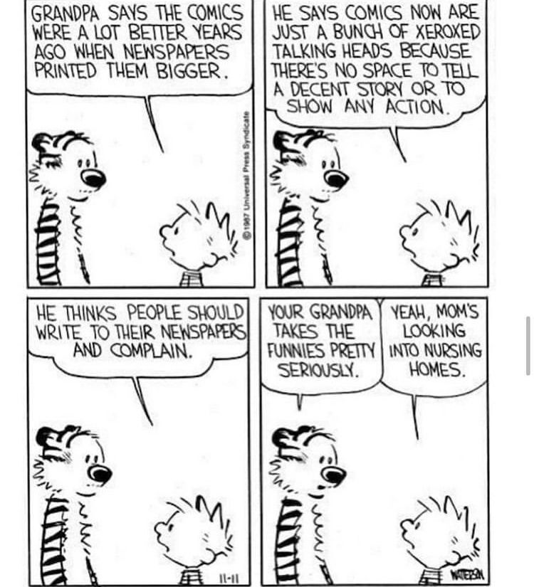
Calvin and Hobbes even has a strip poking fun at this phenomenon in comics, the joke being that the panel never changes from Talking Heads, while Calvin's Grandpa was complaining about just that.
It isn't just movies and comics that support visual narrative, but even commercials, marketing and advertising. Thailand has become a viral example, with multiple commercials becoming adored worldwide. To some these may seem a bit dramatic, however the reason these commercials have become so successful is that they use visual narrative principles combined with solid storytelling to create an engaging commercial. Even those who don't speak Thai, the stories are easy to understand using visuals. This is the key to a GREAT story in visual narrative terms, you shouldn't rely on text or dialogue to tell your story, but rather use it as a way to clarify and embellish your already existing story.
Even if you forgot the product it was selling, it compels you to watch, and these ads often have a sharable quality to them. This helps them by leading to a wider pool of possible customers who might be interested in what they are selling. So in the long run, it's a masterful plan that works for the ones doing the advertising!
So if we can’t use our words to communicate, how do you show our intent? One book that shows this concept well is Framed Ink by Marcos Mateu-Mestre (Volume 1 and Volume 2). At the bottom of this article, you'll find links to suggested resources.
Let’s get to it!
So now that we know what visual narrative is and why it is important, we need to learn about how visual narrative actually works and the principles behind it. There is a lot to cover, so I'll be breaking this down into multiple parts to cover it all. For this first article, we are going to cover the basic principles of visual narrative with examples.
Size:
Users notice larger elements more easily and can affect the perceptive balance of power. For example, if we have a one person wielding a blade ever another who is cowering in fear, it would make sense to ensure the threat seems larger. It will make it feel more intimidating, powerful and make the victim feel weaker and more helpless. In the example below, the man on the left is larger, he takes up almost twice as much space as the man on the right. While he is closer to the camera, this is done intentionally, or rather, intentionally exaggerated. This gives him more power, independence and generally will be viewed as more important compared to his partner.
Color:
Bright colors typically attract more attention than muted ones. While Manga isn’t usually colored, it can be, so if you intend to use colors, pay attention. The colors you choose REALLY matters, from what color schemes you use on your characters to the background colors to lighting in the room your characters are in. Everything matters. Color affects mood: cooler colors can be depressing, slower, calmer, inquisitive, thoughtful, serious and quiet; while warmer colors can be loud, brighter, angrier, faster, attention grabbing, heroic and more. What complicates this even more is color meanings vary by culture. For example, white can be seen as pure, perfection, clean and good in many western colors, but in places like Japan, it's more associated with death and the afterlife.
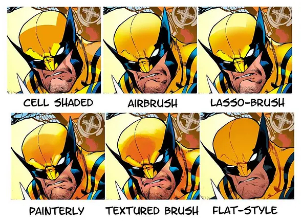
When applied to comics, you have to be sure that your colors not only look good, but the style is consistent, colors are consistent with characters. Below I've included a sample of different styles that are usually available in comics and manga. While it's ok to grow and change with your work as you gain more skill, trying to keep the style as consistent as possible is going to help in the long run. It doesn't really matter what style you choose, but it can help you to get hired if you can perform many of these as a colorist. Notice, however, that all of them have good contrast, something I'll discuss in the next section.
Contrast:
Dramatically contrasted colors are more eye-catching. The trick here is to make sure your values look good at the same time as your colors if you are doing a color comic or manga. What are values? Values are the lightness and/or darkness of a color. If colors are too close in value, even if they are very different in actual hue, it can cause the contrast to be weak and be difficult to see or be muddy. This is actually a very common problem. Now there are times you want contrast to be unclear or muddy, and there are times you want contrast to be clear and easy to understand. Knowing when to use each type of contrast can really add a lot of mood and atmosphere to your story.
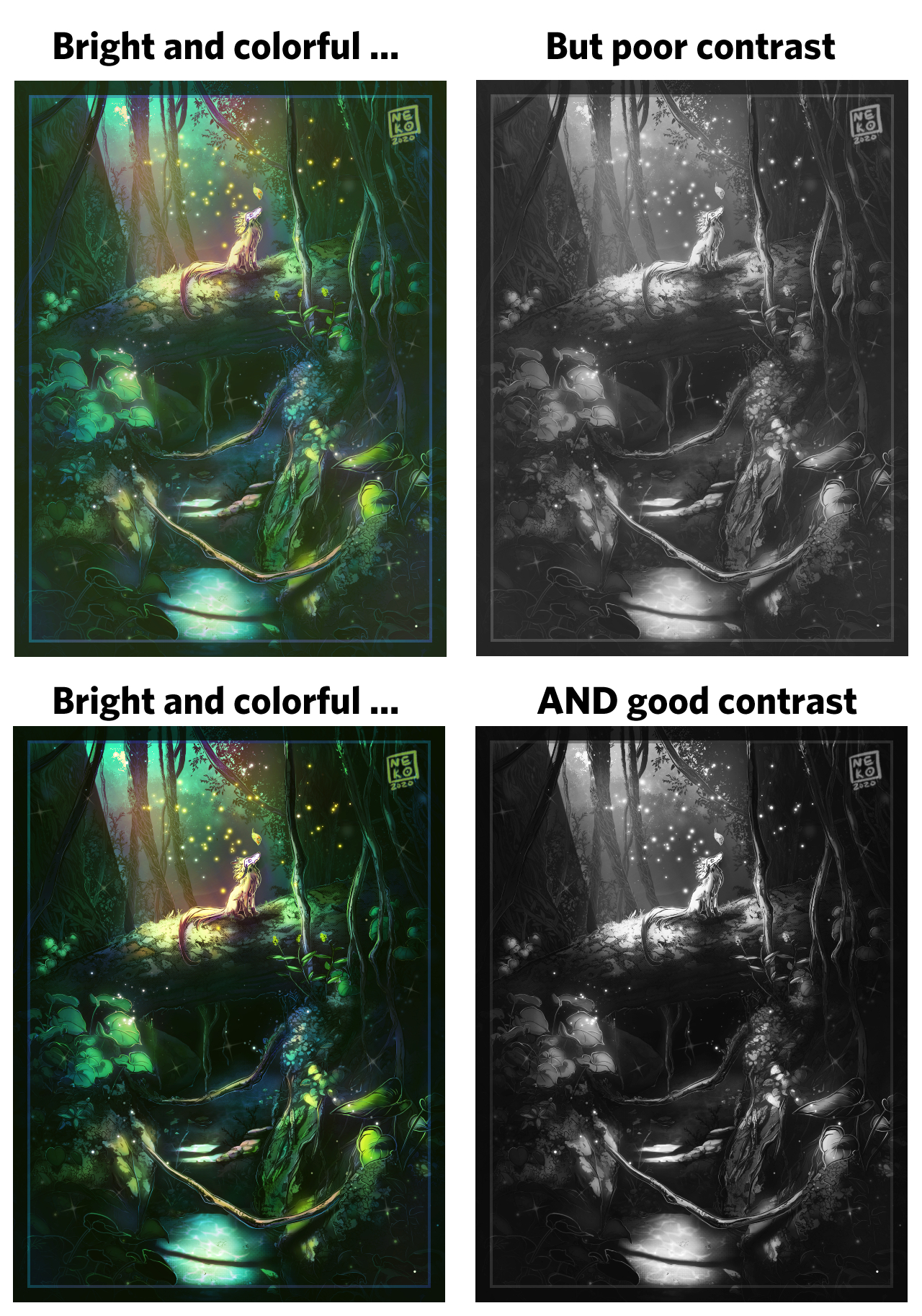
In the example below, the first image might look nice in terms of colors, but it might look a bit off. It's a bit too green, even though it's bright and colorful. But checking the values, we can see what the issue is, there's not enough contrast and a lot of the same values of grey take up most of the image. We can fix this by adjusting the highlights, midtones and shadows. We can adjust these by changing colors, using adjustment layers or filters. Just be sure to check your values before you settle on what you think looks good.
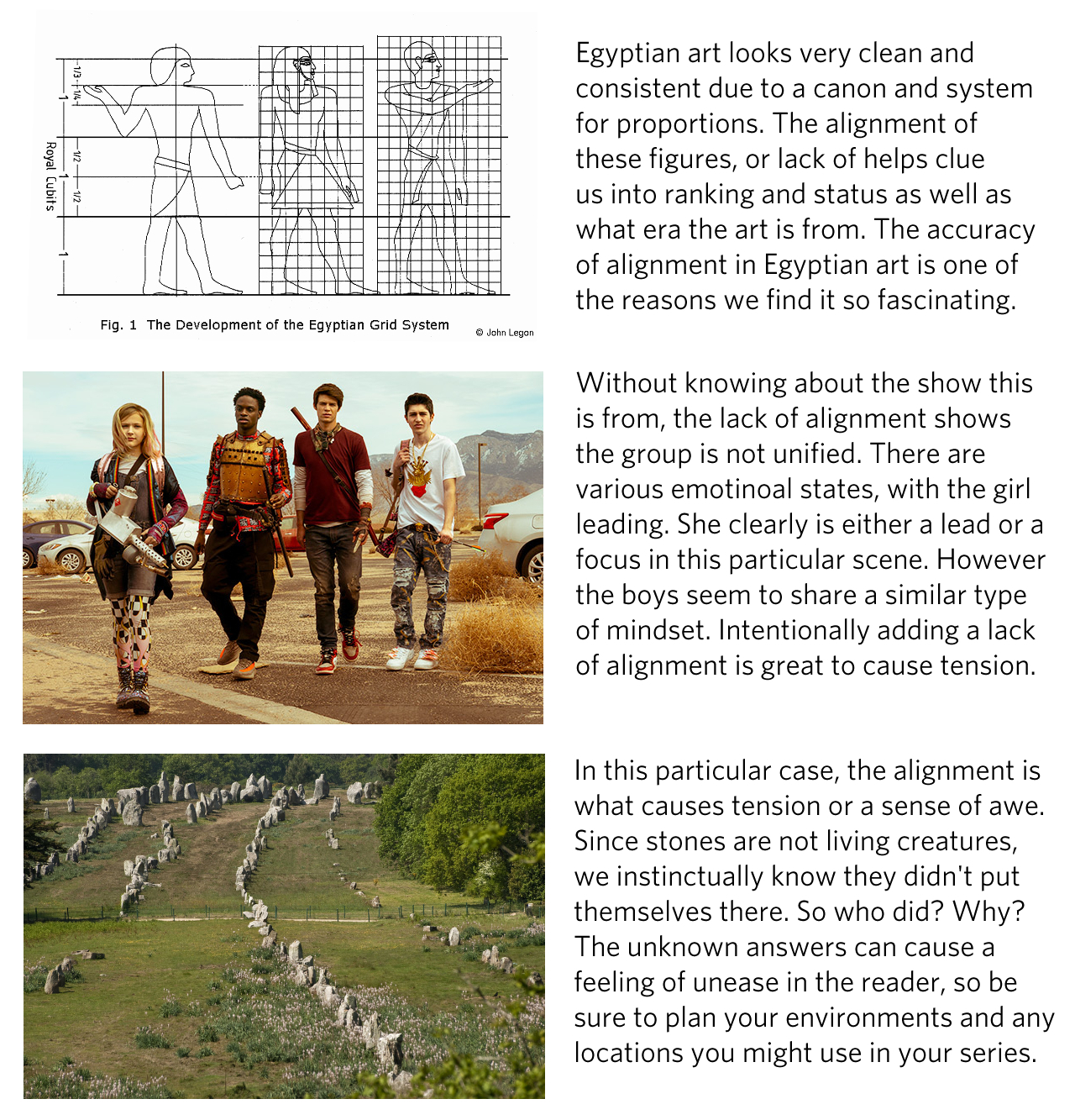
Alignment:
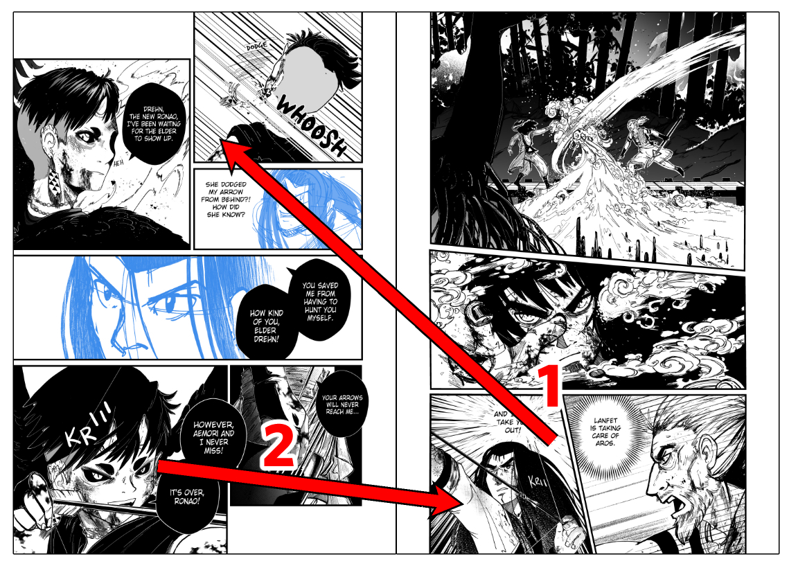
Out-of-alignment elements stand out over aligned ones. Creating a scene that is generally uniform will be easy to gloss over, however having elements out of line will draw attention to them. It can also hint at the importance of certain elements over others. It gets a little complicated in that both alignment and misalignment can cause unsettling feelings. Humans are innately good at looking for patterns, we find solace and comfort in patterns and aligning features. That said, using both alignment and misalignment to your advantage is a really powerful tool! Here are some examples:
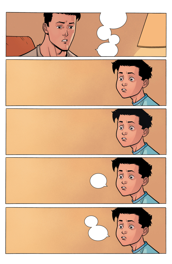
Another way to use alignment to your advantage when it comes to comics and manga is the alignment of the action in the panels themselves. In my manga Ghost Child, I have a scene where a hunter (Drehn) takes a shot at another hunter (Rin). When I was planning my layouts / sketches for this particular spread, I knew that I wanted Drehn's arrow to be aimed at Rin in the scene AND actually in the layouts of the panel. The reason this is helpful is it clarifies what Drehn is aiming for and can heighten any sense of tension by keeping the scene a bit more dynamic. It ALSO leads the reader into the next page. (Remember, manga reads right to left!) Bonus note: the angle of the arrow when Drehn aims is the same angle as the fired arrow that passes Rin as she moves her head to dodge.
Rin then turns around and faces Drehn, taunting him before she draws her own arrow. To mirror his shot at her, I had her angled to that her arrow points directly at him on the opposite page. This creates a full circle and helps with the feel of retaliation. Normally, you'd want the last panel on the left page to align with moving the reader to the next page, not pointing backwards (in terms of reading direction). However, I wanted to take advantage of this tense situation.
It's only on the next page that I break the angle slightly. The arrow still is angled down at a similar angle, but I made it more dynamic and kept her facing towards Drehn to keep them aligned. This alignment can create a really dynamic and fluid scene and transition of panels.
Repetition:
Repeating styles can suggest content is related. This can apply to colors, fashion, cultural aspects of character design and their worlds, rooms and environments, character themes, grouping some characters together, uniforms and separating them from other groups. Even texture can work with repetition to insinuate things are related in some way. A really popular way to work with repetition is motifs and themes. Having certain motifs that show up over and over again, even in different ways, can create a real sense of unity in your story. Repetition in this form creates emphasis on things being the same.
Another use for Repetition is Rhythm and the passage of time. In the below page from Invincible, Marky (the boy) is asked a question. His expression holds for 80% of the page, 4 times in a row, with a lot of large space on the opposite side of him. This repeated stare slows time, as each panel holds our attention as we scan it for information. It lets us directly experience the awkward silence as he thinks of his answer (or if you've read it, his question). I whited out the bubbles due to possible spoilers if you haven't had a chance to enjoy Invincible yet. What's great, though, is that even without that context, you can FEEL and SEE the tension in this page, this conversation.
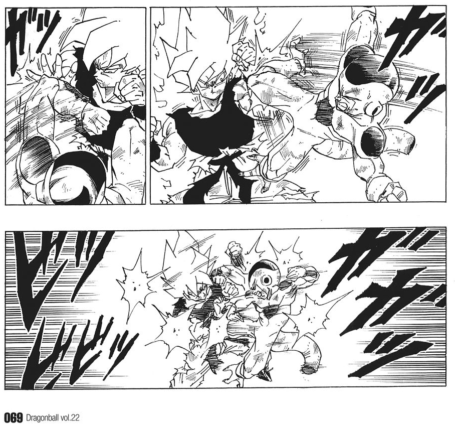
Another classic example of repetition can be seen in fight sequences, especially with punches. Fighting manga like YuYu Hakusho, the entire DragonBall Saga, and Naruto are famous for panels that show multiple impacts (the mini-looking explosions) on one panel. This can help show a lot of quick action without the need for a lot of tiny panels. Here is an example from Goku fighting Frieza, the bottom panel has those multiple impacts.
Proximity:
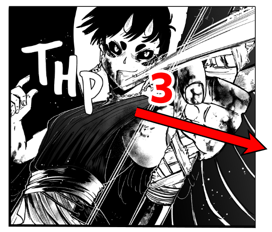
Closely placed elements seem related or connected, but it can also be how consistent the items are spaced out or close together. Being consistent can create a pattern and can give the look of safety, reliability or cleanliness, general feelings of positivity. However, it can also create a feeling of awe if done with a lot of objects on a large scale. Using this for your advantage, especially when it comes to environments and backgrounds, will give the reader lots of information.
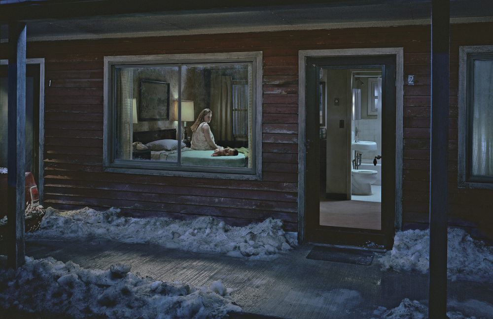
Using this in terms of how close or far you place characters or objects to each other can have a monumental impact on the feelings of a scene. Here is a wonderful example by Photographer Gregory Crewdson. In this scene, we see a (implied mother) staring at a baby (hers?) laying on the bed. The mother is looking at her child laying on the bed, and while she looks at them, her body is facing away from the child. Her child is facing away from her. This creates a large disconnect between our two characters. Looking longer, we see there is snow outside, the door is open, almost as if to invite us inside this quiet apartment or motel. It's honestly unsettling the longer you look at it, and this is intentional. The colors are muted, and dark as well, adding to the coldness of the scene and mood but mimicking her feelings towards the child. We can't see her face, but the scene itself gives off the emotional context we need to understand what's going on or at least give us an idea.
Remember that Photography is as much visual narrative as comics, manga, film, and TV. This scene could easily become a panel or two-page spread in a comic and be VERY effective. You can and should learn from mediums who do the same work as you but in a different way. It can give you extra insights into how to effectively and creatively tell a story!
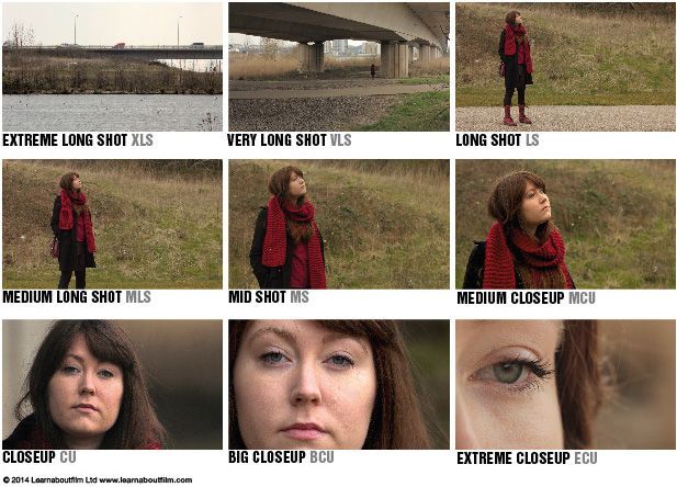
The types of shots you use in your comic or manga also involve proximity, but to the theoretical camera being used. There are a wide variety of shots that are taught primarily in film, TV and animation, however these shots work just as well in comics and manga as well, though aren't necessarily taught. Here is a quick and simple guide to some of the more common shots. It gets far more complicated than this, but that would require its own article to cover.
Whitespace or Negative Space:
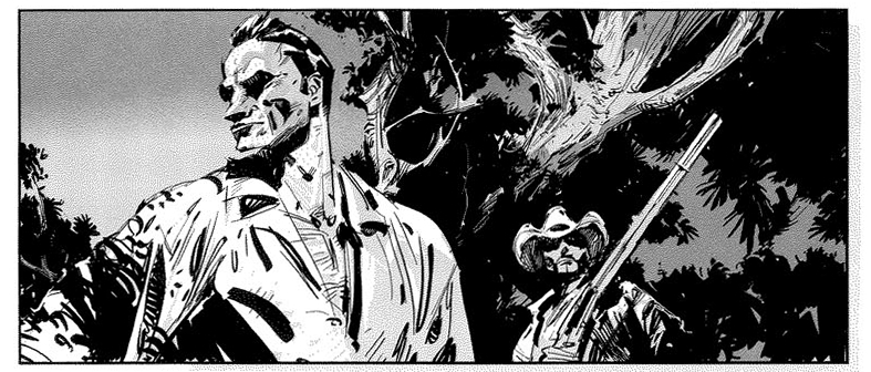
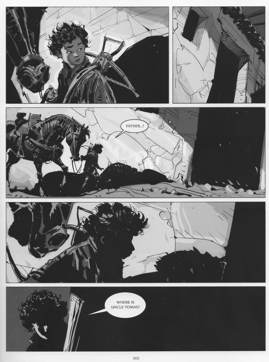
More space around elements draws the eye towards them. Negative space is super powerful, it can create strength or weakness, awe or fear. When you have a large amount of whitespace, the eye is naturally drawn to it and anything inside of it. The comic below by Marcos Mateu-mestre uses a lot of dark space to create a feeling of fear of the unknown in a dark space. This even applies to the face of the child as he looks around the corner. It's more than just choosing to have the face dark due to backlight, it also is very effective at blocking out more information so that we linger over the panels, making us look for more details, more information. We don't find much, save for a “Where is Uncle Thomas?”. It's a painfully slow moment, intentionally made that way to make us uneasy building up for a big reveal later.
Texture and Style
Texture and style can go hand in hand but are not necessarily mutually exclusive to each other. Texture can be used both literally to suggest a texture or tactile feeling of an object OR figuratively to create effects and moods. It's also a practical thing to think about. Too much texture can easily overwhelm the viewer, and the trick is knowing WHEN to overwhelm them and when to use less texture and simply them. This is ESPECIALLY important in manga as most of the time it is black and white, so value and texture are really all we have to communicate our ideas. We don't have color in most cases to help clarify moods and objects, so good value and texture skills are absolutely critical.
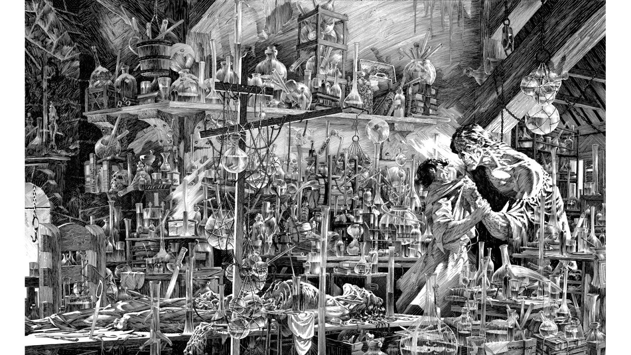
One artist well known for his use of texture is the late legendary Bernie Wrightson. He was a master of texture in his ink drawings, and below I'll show a few examples from Wrightson's work. Firstly is one of his most image pages (a spread actually). You definitely want to full view this one! In this particular case, a lot of the texture is the same value with small differences. It shows the wild imagination of the Doctor in low contrast. Then our eyes get drawn to the lower right corner, where Frankenstein and his monster are in confrontation. It's much higher contrast against the darker corner of the room. Shape wise, it also stands out. So in cases like this, the bottles and vials and beakers are all a lower contrast and generally repeated shapes, so it doesn't stand out as much. It's also used to create a sense of awe and curiosity. So It would be ok to add this much texture. HOWEVER, it isn't required for beautiful artwork.
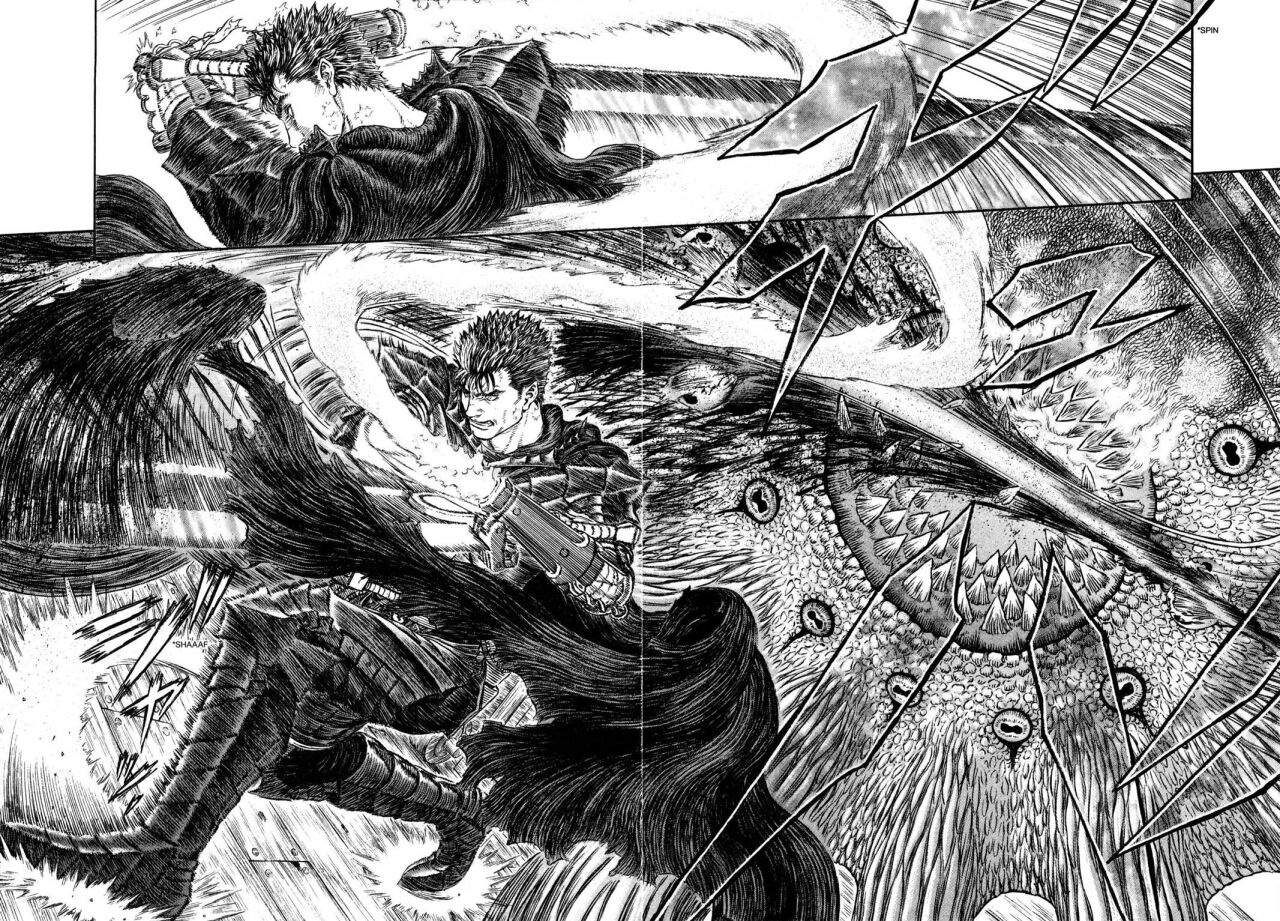
Another artist well known, infamous really, for their use of insane texture is also the late Kentaro Miura, known for his work Berserk. His level of detail is very similar to Wrightson's but used in such a way to make the page look more dynamic, full of motion in addition to using it for information. In the example below, Guts, our hero, is slaying a monster. We are seeing texture to imply motion as well as tactile feel. Berserk is absolutely a WONDERFULLY done manga for examples in creating artwork that is full of texture, but done in a way to add to your work instead of just overwhelm.
However, when making your comic or manga, art like the above two can easily overwhelm the creator with the length of time this work can take. Also, some artwork can overwhelm the readers and make it hard to look at, as beautiful as some of us find it. You can easily take the opposite route and simply artwork using texture to give you just enough information and suggest texture instead of having to draw every little detail.
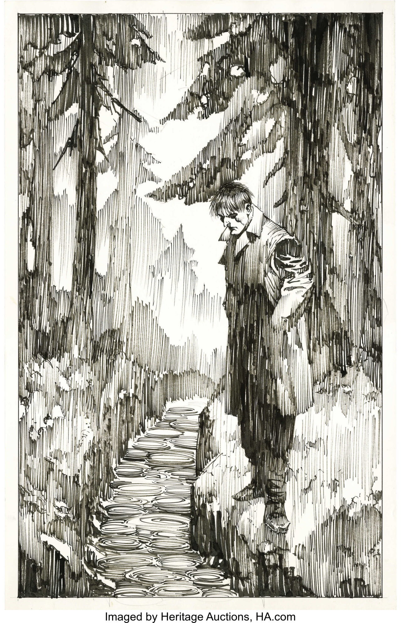
Below are two examples from Bernie Wrightson showing these techniques. Firstly, we have a sample of Frankenstein's monster standing in the rain near a river. Rain disrupts our field of view with dark and lighter lines. It also tends to create a haze due to changes in the atmosphere when it rains. All of these are simulated here, and ripples are added in the water below our monster to help add to the illusion of rain. Bernie did keep the silhouettes of the trees to look like trees, both close to us and in the background, so that information isn't lost to us. But by “shading” with vertical lines and gaps, it leaves a sense of rain when combined with all the other elements. It's very effective! It just goes to show that you can suggest texture and don't necessarily have to draw every little detail.
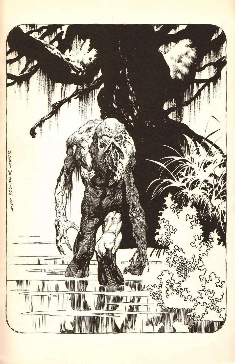
Another wonderful example of simplification (in the other direction) is this second artwork from Bernie Wrightson. I'm telling you, he was a master of texture! In our sample below, the tree behind our monster is solid black for the most part with minimal texturing to give the SUGGESTION of a tree versus having to draw every single little detail in the bark, lichen and hanging moss. Plus, the tree behind the monster is not our focus, it's the monster. Adding lots of detail to the tree might take attention away from our monster. The same thing is done to the bushes and foliage to the right of the monster, as well as the monster's shadow. The texture is simplified here so that it gives the suggestion and impression of a reflection and foliage. Our brains are VERY good at “filling in the blanks” and due to this handy feature, artists often don't have to draw every detail. Merely suggesting a texture is often more than enough!
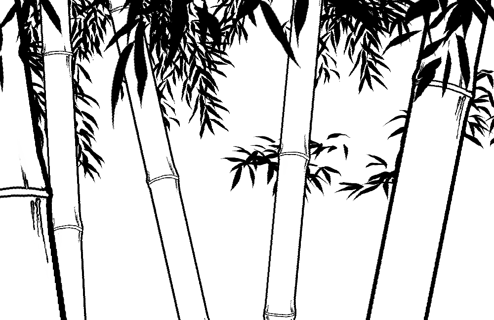
In manga especially, the use of textures and screentones is critically important to master. As shown above in my example from Berserk, you can choose to draw every little detail to suggest texture, however you can also choose to use screentones for this. However, the type of screentone you use is important. Using the wrong one can cause an unsettled feeling with your reader. In the first image here, I have a plain drawing of bamboo. The leaves are in black, not detailed out, as I want the reader to focus on the overall shape of the bamboo. I want the impression of bamboo. I'm not trying to go all in with my details, so I left out the lines on the bamboo leaves. I simply made them singular black masses.
Also notice what we call "line weight". Line weight can imply the thickness of a line or its solidness, its consistency. There are two bamboo with thicker lines, these thicker lines make the bamboo look closer to us (a proximity trick). The bigger leaves reinforce that those stalks are closer to us.
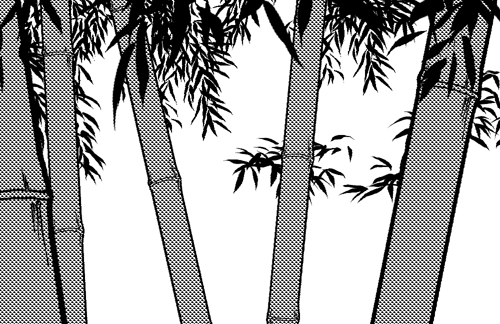
Texture in screentones is usually circles by default. I added a basic screentone made from circles at a medium density/value about 50. We can see that it gets the job done, however can it be improved somewhat? Sure, there are other options.
What if we try some lines and see if that improves our bamboo. If you've been around bamboo at all, you know that it does have some grooves. However, when we add in those lines, it looks... off it doesn't feel right? Can you identify why?
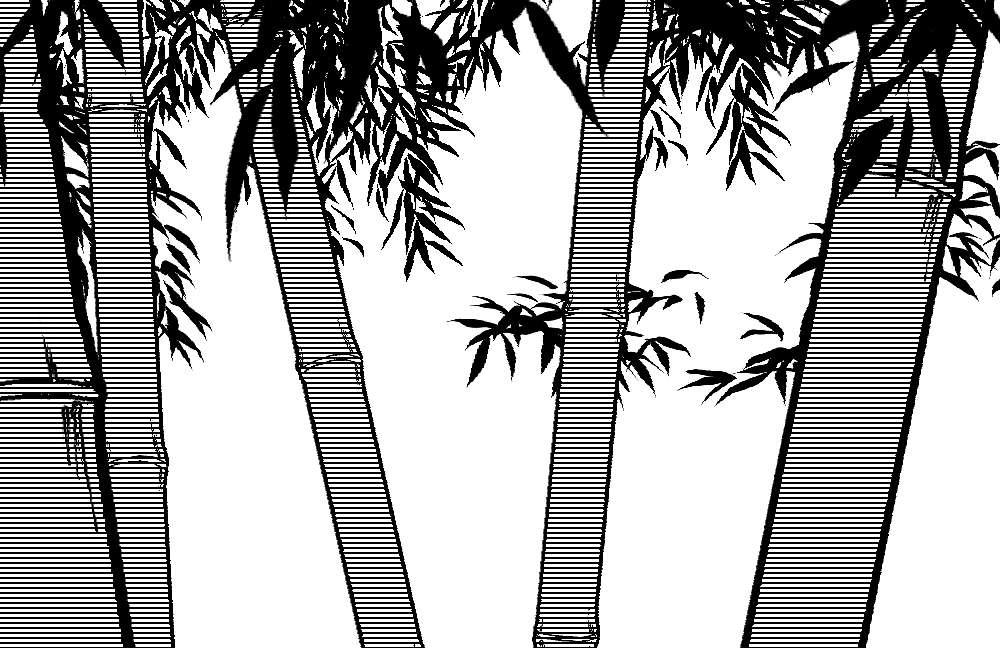
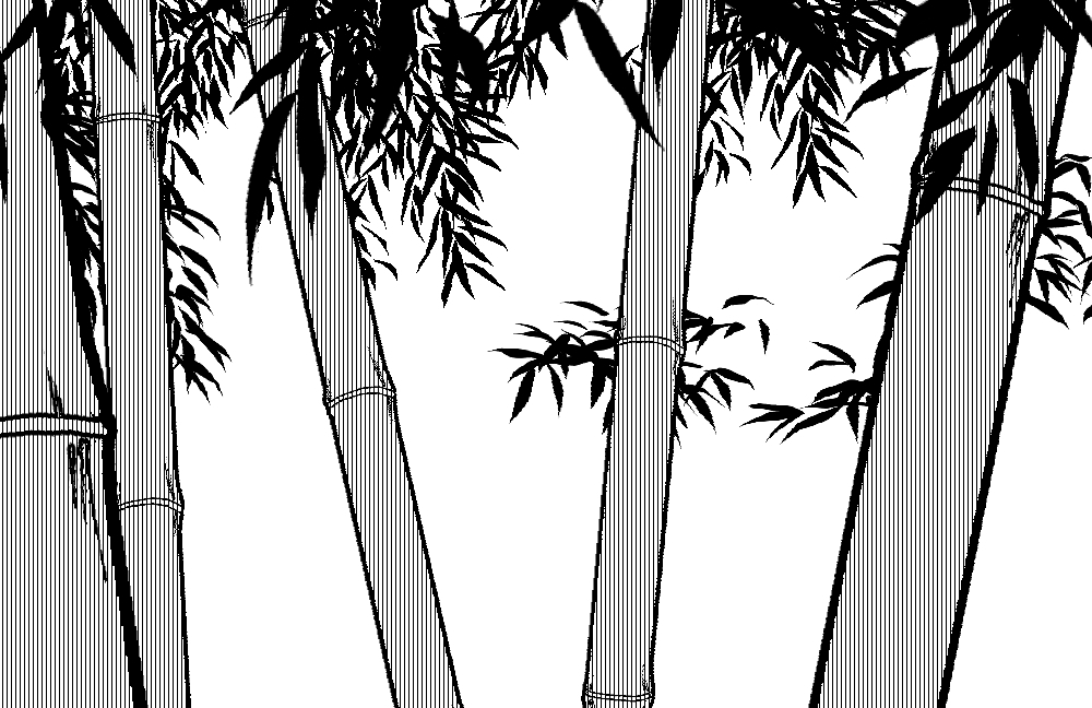
If you can't identify why, it's because the lines are horizontal! If you have any familiarity with bamboo, you'll know that the stalk grows vertically, and it typically haws grooves running up and down on the stalk. The horizontal lines conflict with what our brains know bamboo to be! So once we change that (and lessen the density, so the pattern is not so strong) we can see this tone looks much more natural for what we believe bamboo to be! The biggest problem with screentones is the possibility for a “Moiré pattern” (vertical and horizontal shapes/line appearing in your screentones) and often this is a resolution problem with screens or artwork being misinterpreted by screens or our own eyes. So be always sure to use the proper resolution. For tones, densities of 10, 30, 50 and 70 work the best usually. It really depends on what your resolution and size are to get you the best result. I used the default 60% here and for most of you, there should be a strange vertical striping visible (yes, I did that on purpose to show you this aha).
Lastly, Style and texture sort of go hand in hand. The style chosen can largely impact the mood you set for your artwork. In Comics, the style tends to stay the same, however in manga the style of the artwork can change wildly from the “original” style as a way to change the mood. My favorite manga Yuyu Hakusho by Yoshihiro Togashi has a lot of examples of this. The first panel here is the typical style, somewhat a classic manga style followed by a drastic change in style changing the mood to something far more serious.
Believe it or not, this is a SINGLE page! In manga, the style can change from panel to panel. Another term for this is “Visual Grammar” (which will get its own article later). Visual Grammar is one way visual narrative can communicate in subtle visual ways. Much like a comma, question mark, semicolon or oxford comma can suggest context and completely change the meaning of a sentence, a style or visual aide (like a sweat drop, style change, angry cross) can completely change the context of the panel. In this example, our hero Yusuke is blaming himself for the death of a comrade, and it causes a complete change in his mental state. That is shown by changing the style to a more realistic one.
This effect is also used in this panel. In the fight leading up to this panel, Yusuke is in a very different mental state than the rest of the manga. He's typically a free-spirited and carefree character. He's lighthearted and always passing jokes. Togashi again used a more “detailed and realistic” type of artwork for this panel to show the state of mind Yusuke is in. He's serious, he's beaten up. It's a heavier mindset, so it has a heavier style.
Interestingly enough, you can cause the opposite effect by choosing to draw in a looser and cartoony style. The character with the big head is the SAME character as above, Yusuke Urameshi and his friends on either side of him. The style of the character is really goofy looking and laughing nervously. The style of the characters next to him are also simplified, showing their surprised reactions to him talking this way. The vertical lines help imply the heaviness / gravity of the joke (which honestly is contextual here). However, even without knowing the contest, it's easier to get the feeling Togashi didn't want this to be taken too seriously.
By the way, another stylistic choice here that applies to visual grammar, which I mentioned above, is the speech bubbles. Just like comics, the shape and texture of the speech bubble helps imply the tone of voice and mood of the speaker. In this particular case with manga, bubbled shapes are NOT for thought. They show cheeriness, happiness, joking, lighthearted mindset of the speaker. Thought bubbles in manga are not usually done with traditional thought bubbles like western comics use. So understanding your visual grammar is SUPER important in manga and I would place visual grammar under style. There are dozens of bubble types in both manga and comics, so be sure you know which one you are using and if it is the correct one for the visual grammar of that situation! You could accidentally imply the WRONG context, which could leave your readers confused.
Wow, that was one heckin' article! If you've made it to the end, thank you very much for spending your time with us! This was a lot to take in, but we've only scratched the surface of visual narrative. In future articles, we'll look deeper into framing and composition, camera shots, visual grammar (especially for manga creators) and begin to journey into paneling towards the end of this topic. Understanding these principles and visual narrative in general will take you miles in creating more effective pages!
Thank you all again for your reading and support of this series! I'll see you all in two weeks. Have a wonderful end of November, however you choose to celebrate! Be sure to check out my links below for all my resources hand-picked for you! These will give you a variety of perspectives about Visual Narrative, both for artists and writers! Don't worry writers, I didn't leave you out!
Feel free to leave other wonderful resources you know in the comments below! If I like them I'll add them too!
Resources
Framed Ink Vol 1: Drawing and Composition for Visual Storytellers by
Framed Ink Vol 2: Frame Format, Energy, and Composition for Visual Storytellers Paperback – January 19, 2021
Visual Storytelling 101 - Short introductory video by Film Riot
How to Show, Not Tell: The Complete Writing Guide - by Diane Callahan - Quotidian Writer
Thank you all so much for your time! I'll see you all in two weeks with Article #4 where we will take the principles we learned here to learn about framing and composition, and how to use this to help with paneling your pages! I'll cover both comics and manga in Article 4. See you then!
ArtCrumbs and the GlobalComix Team
LesRay 4 years ago
This was awesome. Thanks for the knowledge.