Feedback for Karamador, especially about if it has too much text - GC Forums
community
Feedback for Karamador, especially about if it has too much text
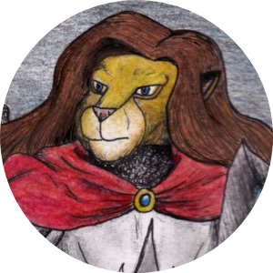
Greetings! I joined this site this year and have uploaded all the stories and pages of my Karamador comic that I have already released on other sites. Right now I would like to hear some feedback, especially for the most recent chapters. I would especially like to hear if there is too much text on each panel, and if there are any other issues.
https://globalcomix.com/c/karamador
Thank you in advance and Happy Holidays!

I mean in the NEWER chapters, not in that first story, which is wordless and it's not the only chapter of the series. Like here for example: https://globalcomix.com/c/karamador/chapters/en/5/1
Some of the talking bubbles seem dense here and there, but I didn't have any problems reading it or following it. I've always thought that making numerous panels of characters talking and responding is kinda annoying, so I'm good with how you did it
Dude the first chapter rocks hell yeah. Did you draw this on paper? Some of the shading is like actually crazy. I only read the first two chapters but I do have a few small bits of advice. In the second chapter, there is a lot of text. First and foremost, you probably want to reduce the number of words being said in each panel (because the readers only going to remember so much). Instead, focus on what sort of information you can convey through the visuals instead of text. Your first chapter does this really well! Another thing, break up the speech bubbles into parts. I try to limit each bubble to a single sentence max. Another thing is that you need to remember that composition isn't just about your art, it's about the way you lay out your panels and your speech bubbles. In the first chapter, since there's not text, the fact that the panels are so close together kinda works. But in the second chapter, the bubbles feel unnatural, like they were pasted over an image rather than drawn into it from the start. Other than that I don't really have any notes. I really like the style and again some of that shading is amazing dude. Keep it up!

I really like Karamador, best of luck with your comic Ilesarki ^^