NO SURRENDER Feedback! - GC Forums
community
NO SURRENDER Feedback!
Hi everyone, I'd love to receive advice and feedback on my first webcomic series!
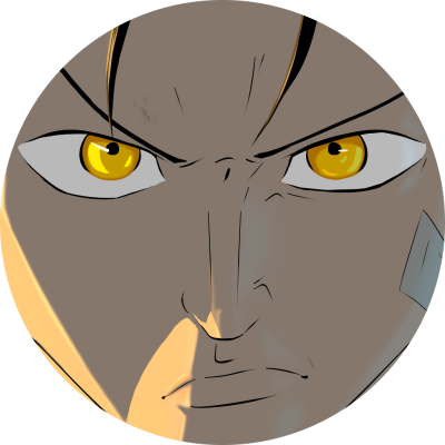
NO SURRENDER:Year 2155, the world has been revolutionized by the war against A.I. The Gogering, a new martial art that use futuristic technologies to fuse machine and man, has emerged as the most acclaimed sport worldwide. Determined to become the undisputed champion, Jani must face not only the strongest warriors but also his inner demons, questioning everything he believes in, to uncover the truth in an environment that conceals something much darker within its depths
---> https://globalcomix.com/c/no-surrender?lang=en <---
Thank you! whish you the best :D

Hey there, I had to fix your link, as it had doubled up and wasn't working. I'll take a look for you now. : )
So I've read what you have up now and here are my thoughts:
1. Personally, the "dead parent" thing was a bit disappointing, it feels almost over-used at this point. I think it would have been far more interesting to see his father suffering day to day in the shadow of who he was, however I love the debate sparked around the surrender/death. That's a really fun thing that you can play on throughout the story, so it balances out. Well done with that plot point!
2. VERY clever with the janitor. I didn't catch it right away. I'm excited to see what happens next there!
3. Fun world building with the robots and cyberpunk-feeling world. Not a genre/theme I usually care to read, but I'm intrigued.
4. As for the artwork itself, I feel like the lighting/shadow choices could be a bit better. It feels like you are using white/grey/black for shading and lighting most of the time, and that really flattens the colors overall. I would experiment more with colors for shading like blues, greens, purples, reds, etc to bring more dynamic and alive feelings. This may be a world of robots, but there's all kinds of colors all over the place. Take advantage of that. I'd study a bit on color theory and try pushing your color choices for shading and highlighting a bit more.
5. In general the flow is very clean and smooth. Great work on that! Occasionally the spacing between action/dialogue feels a bit long and got annoying to scroll so much, but that's something minor and can be refined with time. Breaks between panels are fine, but only keep it as long as absolutely necessary and keep in mind how long a scroll that is for your reader.
Good work so far, I think this has lots of promise.
Thank you for your advice! I'm glad you're enjoying the story!
Honestly, regarding the color scheme, I don't use blacks and grays, I always bring shadows onto the cool colors, but you'r right! The first chapters are the ones I've drawn a bit worse, but in the upcoming ones, you'll see a significant improvement on these aspects :D
I understand the reasoning behind the clichè of dead parent; the story is still long, and the mysteries and reasons behind the death will have a much more significant impact than it currently seems. However, I can certainly understand the criticism about the cliché.
I will also pay attention to point 5 that you described.
Thank you very much again for the time you've taken to read my story and help me! :D
If you have anything else to advise me on, I would be grateful :)

Hi. I noticed quickly the same thing about point 5. Felt like long scrolls between the reading/panels. And the colors too, more saturation, overall and on the skin will help to contrast with the metal limbs.
Thank you for the feedback. Regarding the pacing, sometimes I extend it precisely to give the feeling that more time is passing, or to slow down time and build up the hype, using those extra seconds to better hold onto a revelation or particular phrase. If you also think it's too much, I'll work on it and try to find a suitable balance. Thanks again!
Maybe if you could point out a specific moment where you found the spacing excessive, I would appreciate it. I could understand better! Thank you :)