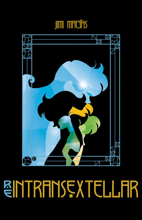
Release #1 - The Hunter
Episode 1
The Hunter
24.5K views • Jan 13, 2025
Still in the dark of night and accompanied by his dog, a man sets out to hunt, taking advantage of the final days of hunting season. It doesn’t take long before the vehicle* they’re traveling in inexplicably stops in the middle of the road, only to be engulfed by a strange wave of nostalgia.
(*) The song the hunter listens to in his car is Space Oddity by David Bowie.
EvanVonDoom 1 year ago
very solid and visually thoughtful,first issue!
jimimacias 1 year ago
Thank you!! I think I am better drawing than writing and developing the story, but I promise I will do my best! 😉
male-ar 1 year ago
Great!
jimimacias 1 year ago
Thank you very much! I hope you enjoy the story as much I am doing drawing it!
EnlighteningMagentaNomad 1 year ago
way too much pre fabricated boring background and figure s every thing
doesn’t look at all like hand drawn authentic self Made cartooning .
EnlighteningMagentaNomad 1 year ago
all obviously computer drawn barely even 2,dimensional . depth? nada.none. the elevator bit was visually interesting the use of Color
but the rest , no
so cut and pasty.
jimimacias 1 year ago
@EnlighteningMagentaNomad I’m not here to debate personal tastes or opinions — I’m genuinely interested in constructive criticism. But as for 'prefabricated backgrounds' or 'computer-drawn figures'... do you really think vector illustration is just a matter of "cut and paste"? Do you seriously believe that digitally drawn images just make themselves? Thank you for your words, anyway. ;)
ArtCrumbs 1 year ago
I think it's a lovely artstyle that reminds me of cutouts, which was always a style I admired. Breaking things down into simpler parts and still looking detailed and layered is really difficult. Well done. : )
jimimacias 1 year ago
@ArtCrumbs Thank you so much for your kind words! 😊 It really means a lot. I always worry that, by using such strong colors and multiple layered elements, the composition might end up affecting the readability. But I’m sure that with feedback like yours, I can keep improving.
EnlighteningMagentaNomad 1 year ago
@jimimacias: hi Jimi first I apologise for the not well considered “critiques”
I shot your way. I couldn’t find a “delete” button I would have used it to vaporise those words almost immediately after I’d typed them.
as I have done hundreds of times in music vids… 2am…nothing better to do than rant about some art I’m not familiar with. Mr. Art Crumbs w his positive reaction to your style which reminded him of cutouts set me straight. I am a beginner cartoonist and don’t have the vocabulary to speak intelligently or expertly about comix making. art in the direction if cut outs with the obvious 2 dimensional aspect because of the use if larger bits (vectors?) rather than hand drawn scribbles w the ability to shade and line and texture us going to be … what it is , an entirely different genre .. like blues to classical or salsa to Finnish folk music . and one must look at each w an open mind to see what one can find and enjoy and learn from . or reject . i. e. I loved what you did w the vibrant reds against black for the elevator panels, but my old fashioned eyes want more textures, muscle outlines etc that more traditional cartooning gives . so it is . as a musician I don’t care for the vocal styles of salsa , but I would give anything to be able to play a Cuban montuno really in a rhythm groove . or tumbao w my left hand .again apologies from a newbie, an unmannered boomer just getting his feet wet in the wide , wonderful deep world galaxy multiverse of comic art
my name is mark t and maybe at some point you will be able to give me some pointers when and if I publish my first 2 comix
all the best
mt
EnlighteningMagentaNomad 1 year ago
I paged through it so quickly the first time, on a small phone screen Without enlarging any images ,so I didn’t notice how you,artfully constructed the forest in the first panels and the beautiful rendering of shafts of light streaming through. or the depth u achevieved w overlays in the panel of the woman in bed. bravo.
btw your story and dialogue skills are
great. cheeky (green cars) introspective philosophical openn ended . we don’t know where you’re going or why but we WANT To FINd out! and hear what you will say to your dog along the way.
jimimacias 1 year ago (edited 1 year ago)
@EnlighteningMagentaNomad
Hi Mark. Thanks for your message — and no worries at all. I understand where you're coming from. I can actually relate to some of the things you said, especially about the images feeling flat or lacking texture. That’s something I’ve heard before, and I totally get that it’s not everyone’s cup of tea.
What people often don’t realise is how painfully difficult it is to draw with vectors — especially when you're doing it all with a regular computer mouse, as I did for every panel of reIntransextellar. With hand-drawing, you can sketch a hand in a few seconds. With vectors, you have to move every single point — node by node — just to get a curve or a gesture to look right. It's slow, exhausting, and honestly, kind of boring to do.
That’s one of the reasons why, when I finished the comic, I decided to go in the complete opposite direction for my next work — and fully embraced a different style. If you’re curious to see how that turned out, you can check out my book Le chant de la femme cryptée, published by Kana:
https://www.kana.fr/annonce-made-in-le-chant-de-la-femme-cryptee-2024
In any case, I appreciate your follow-up and your interest. Good luck with your own comics — feel free to share them with me when they’re ready. We all start somewhere, and the world of comic art is big enough for all kinds of voices and styles.
All the best,
Jimi
ArtCrumbs 1 year ago
@jimimacias: i think you handled it all perfectly! it was very easy to read and understand! I even shared it internally with the team and it was very well received, so please keep up the great work. You've got something beautiful here. Vector art was SO hard for me in college, so genuinely I am amazed when folks can use it.
ArtCrumbs 1 year ago
@EnlighteningMagentaNomad: sometimes another perspective can help us see the things we couldn't before. I'm glad my comment could help. : )
jimimacias 1 year ago (edited 1 year ago)
@ArtCrumbs Thank you so much! That really means a lot — and I’m glad to hear it was well received by your team too, wow!
To be honest, even though I’m proud of how the comic turned out, with time I realized that vector art doesn’t work for every kind of story. I come from a background in graphic design and illustration, so vector was my comfort zone — it felt natural to start reIntransextellar that way. But as the story progressed and the action became more dynamic, I started to feel the limitations.
Vectors are great for creating interesting flat compositions, but when you need to bring in more expressive angles, "camera" movement, or emotional nuance, it can become quite restrictive. I’ve come to think that vector art works best for comics that lean toward introspection or visual poetry, where the aesthetic takes center stage over narrative action.
In the end, I’ve shifted to a very different drawing style — but I guess that’s part of growing as an artist, right? 😄
Thanks again for the kind words and support!
GlidingExtraordinaryYeti 10 months ago
This illustration style is so unique. I'm loving it.